Students from the Schools of Graphic Design and Architecture presented their best Academy projects to a small crowd of industry insiders during a joint end-of-semester show
By Kyle Roe
This past August, a small group of Academy of Art University graphic design and architecture students presented their newly minted portfolios to Academy faculty, guests and industry insiders at the end of the Summer 2018 semester. All of the students were enrolled in either Senior Portfolio (GR 460) or Senior Seminar (GR 875), depending on whether they were studying at the undergraduate or graduate level.
The class taught students how to create a book that showcased their work in a neat and visually enticing layout. “The mission of the class is to show your current and potential value to any employer through a presentation of all your projects, in-depth, so you don’t have to drag your projects around, you can have the actual projects,” explained School of Graphic Design Chair Emerita Mary Scott. “You tell the story of every assignment, and then you create a beautiful, standalone portfolio, that’s a standalone narrative.”
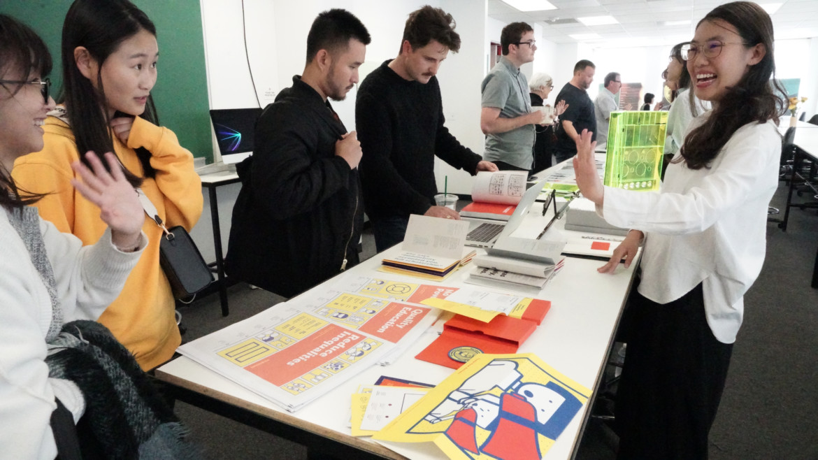
Attendees brushed elbows with representatives from big-name companies like Apple and relative newcomers like COLLINS, a local design firm, who were busy listening to students explain and present a selection of their Academy projects. Beside each of their books was a cache of literal portfolio folders filled with samples of their work.
The small-scale summer show was the class’ culmination, meant to smooth the transition between graduating college and entering the job market. Whether or not they met their future employer at the end-of-semester show, the book they created grants them a competitive edge moving forward in their career.
According to Scott, “You go out into the marketplace with this material that’s so professionally constructed that people are just blown away.”

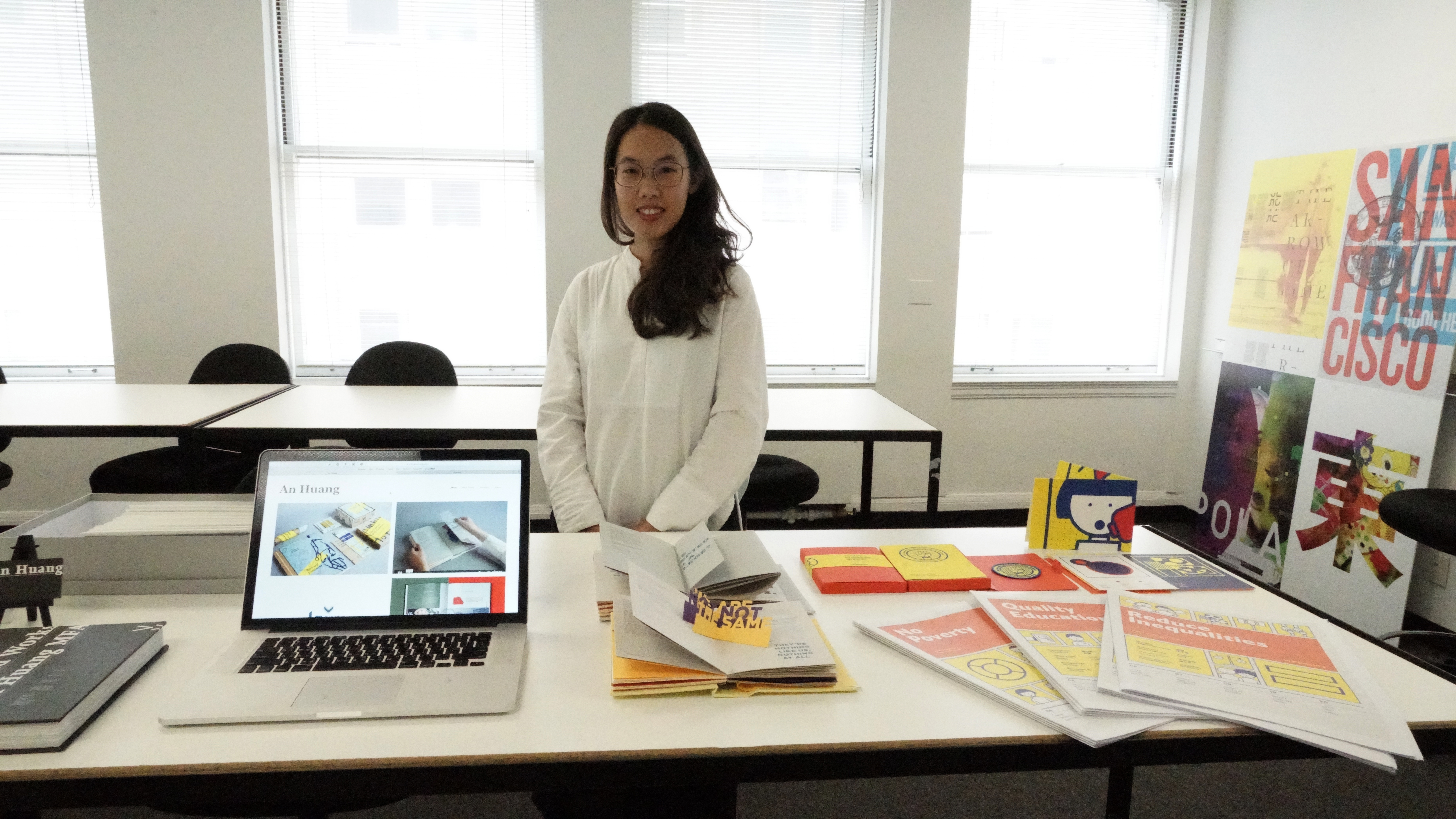
An Huang poses with her portfolio and samples of her work. Photo by Bob Toy.
The graphic design projects were focused on creating a product with a detailed, eye-catching brand. Graduate student An Huang’s was dedicated to spreading awareness on global issues, ranging from poverty and illiteracy to political corruption and U.S. foreign intervention, through a data-and story-driven newspaper and app called VizIssues. The writing is collected from different news sources and arranged alongside data visualizations and images, a mixture of topical portrait shots and minimalist 2-D cartoon drawings, in bright stark colors.
“Most of the [content] is just text, and then bar charts, and I put them in a way that people really want to see, or that’s easier for them to digest,” said Huang. “I also direct people to nonprofits that are fighting related issues, so they can actually take action.”
Other GR projects were more playful, like those of Hannah HK Cheung. One of her projects was a redesign of “Pandemic,” a popular cooperative board game that challenges players to find the cure for four pandemic diseases. The game board was an acrylic world map meant to make the game more immersive. She also designed a card game called “Kill the Sheep,” a “promotional mailer piece” inspired by novelty gift brand Unemployed Philosophers’ Guild. According to her website, “Sheep represent the part in all of us that blindly follows, thus ‘Killing the Sheep’ means killing the ‘unexamined’ part in all of us and letting our individuality shine.” The cards’ irreverent designs surgically collage together pictures of historical figures with plants, animals and random objects.

Hannah HK Cheung poses with her portfolio and samples of her work. Photo by Bob Toy.
“I really took the opportunity in school to go my creative route without the commercial boundaries,” Cheung said.
The architecture projects were focused on playful, yet concrete, solutions to real problems. For example, Jing Zhang, a graduate student from Beijing, set out to remedy the lack of green spaces and inaccessibility of break areas in the primary schools of his metropolitan hometown.
In the densely packed school buildings, which can measure up to six stories tall, “some students have to walk down to the ground floor for their class break, and it’s like 10-20 minutes. It takes too long for them to walk down to the schoolyard,” Zhang said. In response, he thought up a novel solution.
“I thought, ‘Is it possible to share the schoolyard with every level of the students on different floors?’” Zhang explained. “So I decided to divide this big schoolyard, make it smaller, and add it to every floor. So everyone can very easily attach to a new schoolyard.”

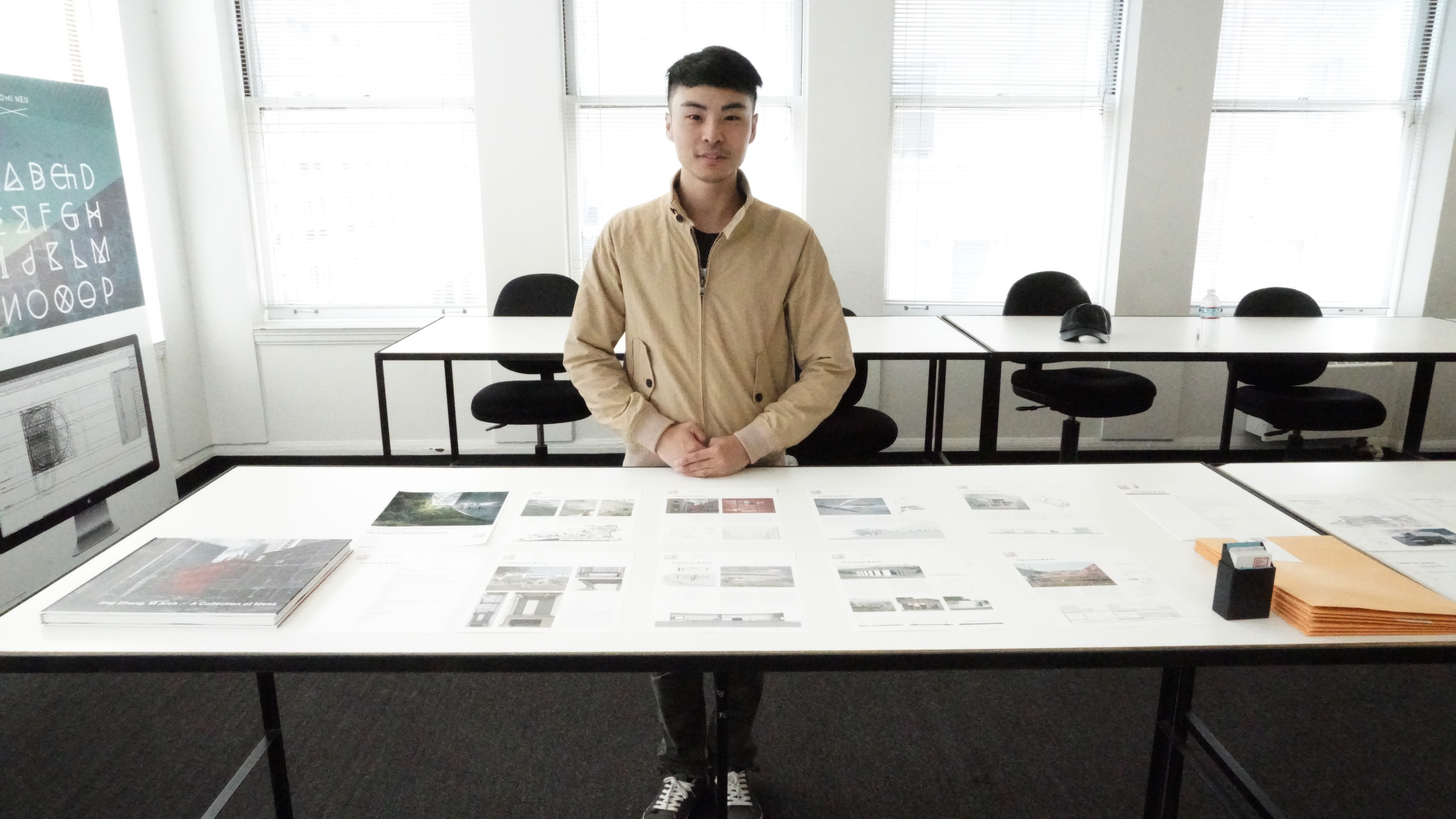
Jing Zhang poses with his portfolio and samples of his work. Photo by Bob Toy.
His portfolio book contains prototypes and imaginings of the buildings, covered in greenery on every floor, reminiscent of a multi-story California Academy of Sciences. The courtyards are connected by staircases and make up the total size of a larger standard courtyard. “I think it’s good to cut it like a big cake, and share it with everyone in every level” Zhang remarked. “So the schoolyards are stacking together, rotating spiral up. It’s like a ramp going all the way to the top.”
Other projects were more experimental, like Jingyuan Shi’s computer-modeled abstraction of four screenshots from the 2002 film “Punch-Drunk Love,” assembled into a building. To accomplish this, Shi “abstracted the images into frames, combined the frames together to build a frame model, and then added surfaces to the model.” The jagged overlapping structures are digitally rendered to solve Shi’s theoretical puzzle: maintaining each screenshot’s ocean-facing view in the same small area, by stacking four copies of the same structure on top of each other.

Jingyuan Shi poses with his portfolio and samples of his work.
“The difficulty was making the model into [one] building,” Shi explained. “So we started to plug the programs in, and then we saw what worked.”
Although this was a smaller showcase, favorable first impressions were made and prospective employers explored students’ work at length. The participating students were afforded more professional exposure than the average course, a fitting reward for a summer spent polishing up their portfolios.
Featured photo: Senior Portfolio/Seminar students discuss their projects and portfolios with guests at the end-of-semester showcase. Photo by Bob Toy.
