By Greta Chiocchetti
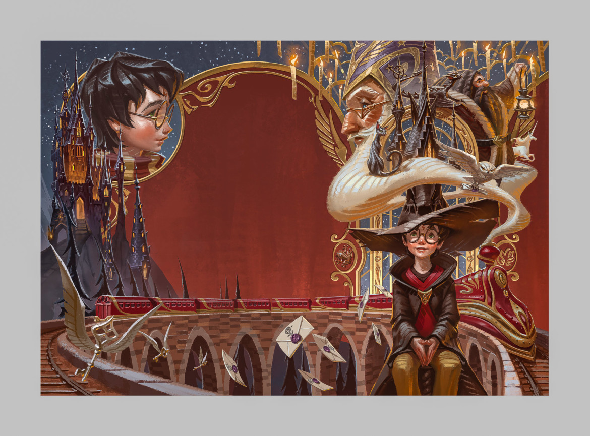
Like those of us who grew up in the late ‘80s and ’90s, Arus “Arch” Angchuan—also known as Arch Apolar—is a Potterhead. The recent M.A. graduate of the School of Visual Development (VIS) fondly remembers his dad reading the Harry Potter books to him at bedtime—and being captivated by the iconic cover and chapter art by illustrator Mary GrandPré.
When Apolar received a direct message on Facebook from a local Thai publisher asking him if he would be the artist to refresh the series art in a special edition release, he practically felt himself levitating off the ground.
This July, the Thai edition of the first book in the series, “Harry Potter and the Philosopher’s Stone,” will turn 20. To commemorate, publisher Nanmeebooks has released a special edition of the series, including new, full-page chapter art and cover art, along with bookmarks and postcards that exclusively come in the box set.
Nanmeebooks aimed to revisit the cover art, using artists from the “younger generation,” according to Apolar, who works as a freelance visual development artist. “Typically, they would choose an artist who has been working in the industry for quite a long time—someone in their late 30s or 40s. I feel so fortunate to have this opportunity so early on in my life.”
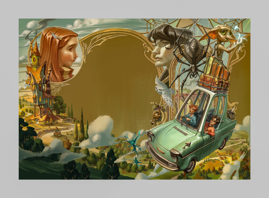
Apolar’s cover artwork for Nanmeebooks’ special Thai edition of “Harry Potter & the Chamber of Secrets.” Image courtesy of Arch Apolar. 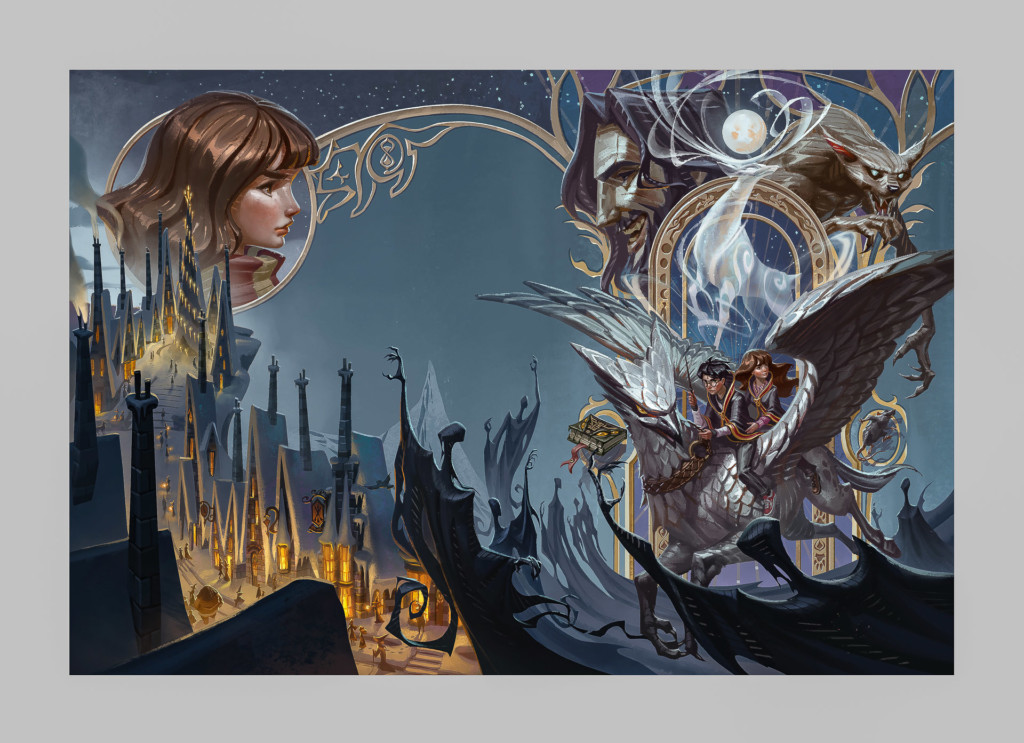
Apolar’s cover artwork for Nanmeebooks’ special Thai edition of “Harry Potter & the Prisoner of Azkaban.” Image courtesy of Arch Apolar.
Once Apolar learned that he would be responsible for the redesign, he felt excitement along with tremendous pressure; Harry Potter fans are especially devoted to the series, and he wanted to make sure he did them justice.
“I definitely felt a lot of weight on my shoulders. I wanted to represent myself as one of the fans who love this series the most, you know, not just an artist that got this job,” said Arch. “I wanted this to be a love letter to fans and find a way to combine all the things that they know and love the most about this series into the design.”
Apolar began his process by reaching out to his friends—fellow Potterheads—for input and inquired about their favorite elements from the books. When he received a slew of varying responses, he realized he couldn’t simply choose a couple of features from each story but had to find a way to portray an abundance of them.
“I feel like everyone has a different answer to why they love Harry Potter,” said Apolar. “That’s where the concept came from, of combining all of everyone’s favorite elements into the overall design.”
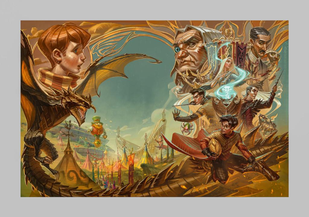
Apolar’s cover artwork for Nanmeebooks’ special Thai edition of “Harry Potter & the Goblet of Fire.” Image courtesy of Arch Apolar. 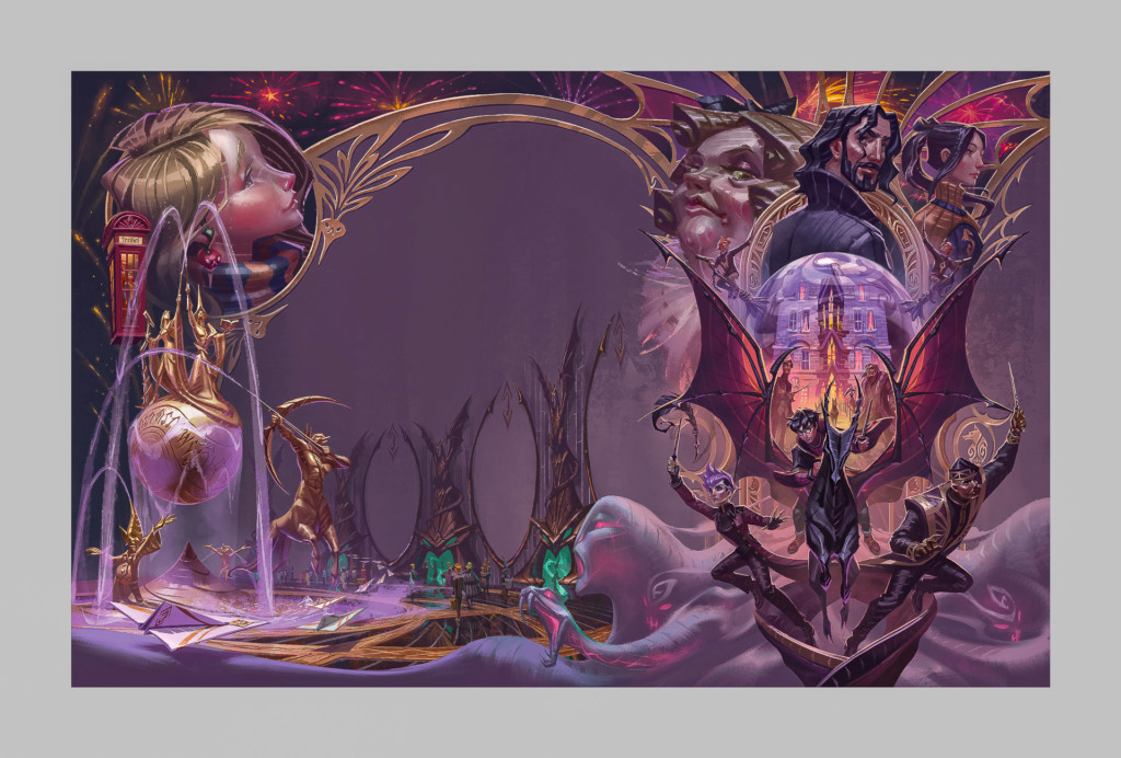
Apolar’s cover artwork for Nanmeebooks’ special Thai edition of “Harry Potter & the Order of the Phoenix.” Image courtesy of Arch Apolar.
Although Apolar said he enjoyed much creative freedom throughout the illustration process, there was a major hurdle to overcome: he couldn’t depict images from the movies—including the well-loved actors—due to Warner Bros.’ copyrights. This made illustrating Severus Snape, for example, particularly challenging.
“When you think of Snape, you see Alan Rickman in your mind, right? So, it was hard not to base that design on his image,” said Apolar. “So I tried to have that balance, where I could give a hint that that was who he was, you know, without using the exact design.”
Moving across the globe from his native Thailand to pursue his dream of becoming an illustrator, Apolar took full advantage of his time at the Academy. As a student, he was motivated to push himself with each project.
“In addition to his incredible talent, he also possesses a tremendous work ethic. He’d typically deliver significantly more than was asked of each assignment,” said VIS Associate Director Christopher Carman, who taught Apolar in his section of VIS 611: Visual Elements of Story in the fall of 2018. “Much like the rest of the world, I was blown away at not just the skillful rendering of each piece [from the 20th anniversary Thai edition of Harry Potter], but the graphic design and storytelling on display as well. Despite their complexity, they’re all immediately accessible and easy to read visually—which is a testament to his terrific design and compositional skills.”
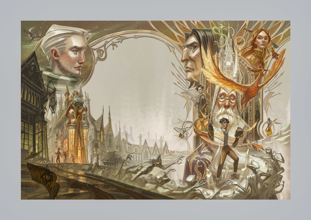
Apolar’s cover artwork for Nanmeebooks’ special Thai edition of “Harry Potter & the Half-Blood Prince.” Image courtesy of Arch Apolar. 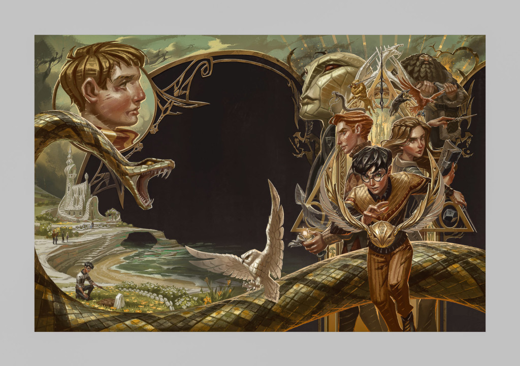
Apolar’s cover artwork for Nanmeebooks’ special Thai edition of “Harry Potter & the Deathly Hallows.” Image courtesy of Arch Apolar.
Apolar, who earned a bachelor’s degree in architecture prior to attending the Academy, used his structural knowledge to design arch-like frames bordering each of the covers. He centered Harry in each illustration but varied the scale to add visual interest and to allow him to include as many references to the storyline as possible. In each work, there are “Easter eggs”—hidden references to particular objects or scenes from the story.
Drawing from what he called the “golden era of illustration,” in the early 20th century, Apolar aimed to create a design that would appeal to fans around the world, not just in his native Thailand. He was deeply influenced by the works of illustration legends such as Norman Rockwell and J. C. Leyendecker. Though he often looks to the past for inspiration, Apolar says his illustration style is constantly in flux and varies with each project he takes on.
“If you look through my work, I always explore different styles—that’s part of the reason why I studied at [the Academy] too, was to experiment,” Apolar said. “I always kept changing my style in each class and each project because I wanted to keep challenging myself to come up with new things and try as much as I could. I haven’t found any style I want to just be stuck with forever.”
