
By Greta Chiocchetti
Like many others, Academy of Art University alumnus Chaowat “Pong” Lertsachanant left his heart in San Francisco after his first visit.
“I really loved the charm of this city,” said Lertsachanant. “The views are so great because of all the hills, so every scene is almost perfectly composed. I love all the varieties of people here—all different races, and people wear all kinds of different styles. And of course, I love the weather. It’s good all year long, not like home. It’s quite hot in Thailand.”
Combined with the fact that Lertsachanant had big dreams of becoming a concept and visual development artist, making the big move to the City by the Bay made a lot of sense.
“Of course, San Francisco is also very close to the industry I wanted to pursue—near all the major studios in the Bay Area but also close enough to L.A.,” said Lertsachanant.
After earning his M.F.A. in visual development in 2019, Lertsachanant quickly learned that he had made the right investment after landing his first big gig as a concept artist for Electronic Arts (EA), working on the Sims 4 team.
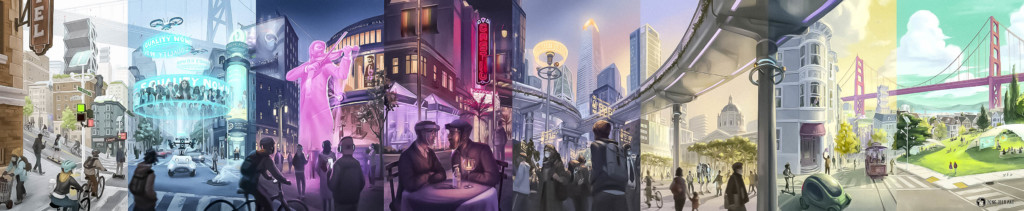
But this summer, Lertsachanant’s reverence for the city of San Francisco and his skills in visual development brought an exciting opportunity: illustrating the San Francisco Chronicle’s “Throughline” series, a project exploring the Bay Area of the future—post-pandemic. In an interview with Art U News, Lertsachanant shares how he imagined what tomorrow might look like in his beloved city.
Were you an artistic child? Did you always know you wanted to pursue a career in art?
I think it’s stuck with me since I was young, though at times I’ve tried to run away from it. I would ask myself, “Why am I not good at math? Why am I not good at science?” because I thought at times that it was useless. But I always went back to it. In school, I would participate in anything creative with joy.
What was it about the Academy of Art University that set it apart from other art schools in California?
I had a friend attend the Academy about three years before me, so he mentioned to me that there was this big event called Spring Show where the school invites industry to come in and meet with students—and if you’re good enough, you can show your work and have the opportunity for those conversations. That’s how I got my job at EA.
And of course, the instructors were a big part of my reasoning. I could see that my friend had improved a lot from the time I had last seen his work. So, the foundation at the Academy is really good if students work hard enough. And many of them work in the industry themselves, which is helpful because they can give advice to people who have never worked in the industry before. I also had an instructor who worked at Zynga before, so he was able to introduce me to the team and show them my portfolio, which gave me the chance to have an internship there.
How did the opportunity to illustrate the San Francisco Chronicle’s “Throughline” section covers come about?
For this one, they found me. I do a lot of color in life studies and plein air painting of San Francisco, which I would post a lot of to Instagram. So, I was very lucky that they found me and that they reached out to me through Instagram. They were looking for someone with a background in visual development, someone who could imagine what the city would look like in 10 or 20 years. I felt so honored that they asked me to take on the project.
The project consisted of eight separate panels that came together in the end to create a larger panoramic image. How long did each element take?
We took about a week and a half to figure out all of it first—we planned how all the issues would fit together in the end. After that, it was basically one panel each week because it needed to be ready in time for the coming issue of the paper. The painting itself took me about three days, and then I would send it over and wait for feedback, then make whatever changes they suggested.
That deadline seems tight! Did it stress you out at all?
At first, yes! But after a week or two, I got into my own routine. I feel that it’s like a sport—at first, you have to warm up and you don’t feel ready, but when you’re on the field and have played the sport for a while, you realize that now you know how to pace yourself.
The initial period of sketching challenged me a lot. After [the people from the SF Chronicle] briefed me and asked me if I could do this project, of course I said yes. But on the inside, I was screaming, because it was such a big project. And I had to draw San Francisco, which I had only been living in for three years. I worried that people who have lived here their whole lives would see it and think, “Why did he make this mistake?” I was very worried that I would draw something inaccurate.
How did you decide which scenes from San Francisco you would represent?
We worked together on that. Some of the scenes [the SF Chronicle] already had ideas for, and then I came with ideas: “We could do this location, or this location…” So, the first idea came from the Chronicle, but we sort of bounced ideas back and forth—if I had a better idea, then they listened. But we worked together as a [collaboration], finding the best solution to represent the story and the topics that they published every week.
How did you visualize the futuristic elements?
They gave me criteria for going futuristic, but not too sci-fi. A lot of it came from their references and what I had seen in movies, but also how I interpret life in San Francisco after the pandemic could be—the most idealistic version.
What was the biggest challenge of this project?
That each panel had to be connected in the end. Each one has its own story. Also, they had to be vertical, which I found difficult to tell a story in that format. In each panel, there was a lot that needed to go into it to tell the story. And when it had to connect in the end, the different perspectives needed to make sense in some way. I came up with a solution that [I thought was] okay, maybe these perspectives aren’t the same, but at least the big shapes of the connecting part should make the eyes flow. To figure that out in such a short time was a big challenge for me.
Also, this is a print illustration, not digital. People stare at it from top to bottom, like every inch of it, so I had to make sure that every tiny piece made sense and looked like San Francisco as much as possible.
Lastly, the deadline was definitely a time crunch. I needed to meet the deadline because they had to print every week. If I missed that deadline for whatever reason, the whole process would be messed up. So, it was like, failure is not an option.