By Isabella Cook
Academy of Art University’s School of Visual Development (VIS) hosted storyboard and concept artist Dermot Power on the afternoon of Wednesday, Dec. 7. During an online webinar, Power spoke with Academy students about his career, including working on the “Star Wars” and “Harry Potter” film series as well as the new hit Netflix series “Wednesday.”
“Welcome everyone,” Executive Director of VIS and 2-D Animation and Art Direction Nicolás Villarreal said, greeting the online audience. “We have this incredible opportunity to witness—to me—one of the best designers in the industry.”
“We’re incredibly lucky,” added VIS Associate Director Christopher Carman. “Dermot’s work is, well, you know it. If you’ve watched any movies in the last 20 years, you know his work.”
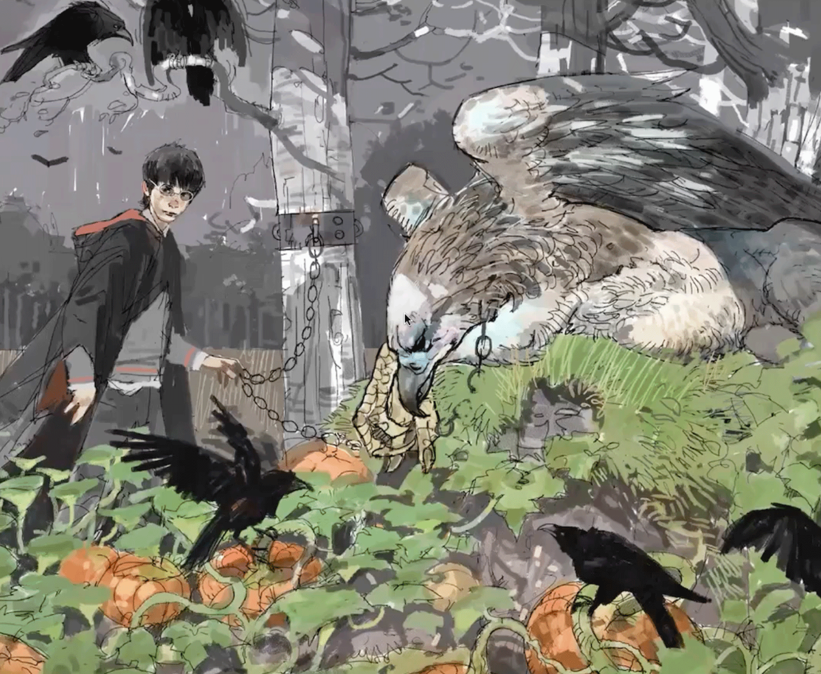
Power’s portfolio dates as far back as the 1990s and includes notable projects such as “Star Wars: Episode II – Attack of the Clones,” “Star Wars: Episode VII – The Force Awakens,” “Harry Potter and the Chamber of Secrets,” Harry Potter and the Prisoner of Azkaban,” “Batman Begins,” “V for Vendetta,” “Ready Player One,” “King Arthur: Legend of the Sword,” as well as the “Fantastic Beasts” film series.
The early days
At the start of his presentation, Power dove into the early days of his career, starting with his move to London in pursuit of becoming an illustrator. He initially received criticism due to his “comic book-y” style. Revisiting comic books that he had read six or seven years prior, Power remained deeply appreciative of artists like Brian Bolland, Glenn Fabry, Bill Sienkiewicz, and Simon Bisley.
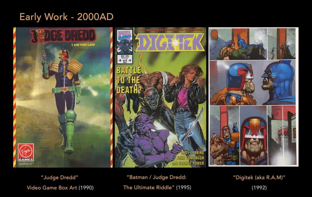
In 1990, Power was commissioned to create the video game cover for “Judge Dredd.” The “Dredd” assignment led to work with 2000 AD (a weekly British science fiction-oriented comic magazine), where Power helped produce well-known titles, including “Sláine.” Additionally, he worked on “Digitek” for Marvel UK. In 1997, Power moved away from comics to pursue a career in film illustration. However, he attributes much of his knowledge of sci-fi, costuming, and characterization to his early comic book days.

“I got back into the comic book industry, inspired by that really, and … learned my trade as a comic artist over the next eight years,” said Power. “The problem was, I was quite slow as a comic artist. When I joined comics in the U.K., we were all doing what Bill Sienkiewicz was doing, which was to paint and draw everything, which is very time-consuming. But when I hopped over to film, that was fantastic training because all the things I would do to be a fast comic artist I brought into my work as a film artist.”
Later, Power touched on the challenges of transitioning from a solo comic artist to working with an art department for film and TV. He admitted that he struggled to transition from being a solo star meeting deadlines to working with a team and the politics of it all.
“The very first job I did was ‘Merlin,’ for TV Hallmark for Director Steve Barron,” said Power. “The costume designer called me up and was really annoyed that I was doing costumes because it was stepping on her toes. And then the production designer called me up and was saying, ‘Oh, what’s the budget for that visual you did?’ and ‘What’s the budget for that set?’ and I was like, ‘I don’t know.’”
Power said this was the first of many lessons he learned on set, the moral of which was to develop a thick skin. “You may not be celebrated in the way that you’re hoping,” Power cautioned.
Influences
Questions were asked throughout the presentation, and one inquired about the impact of comic artist Mike McMahon’s influence on Power’s style, especially in his approach to simplicity and shape in film work.
“McMahon is a huge influence, but he’s sort of so unique and unusual in the way he draws, you couldn’t imitate him,” said Power. “I wouldn’t even know how to start imitating McMahon … but a huge influence he had on me was making it [the art] chunky.

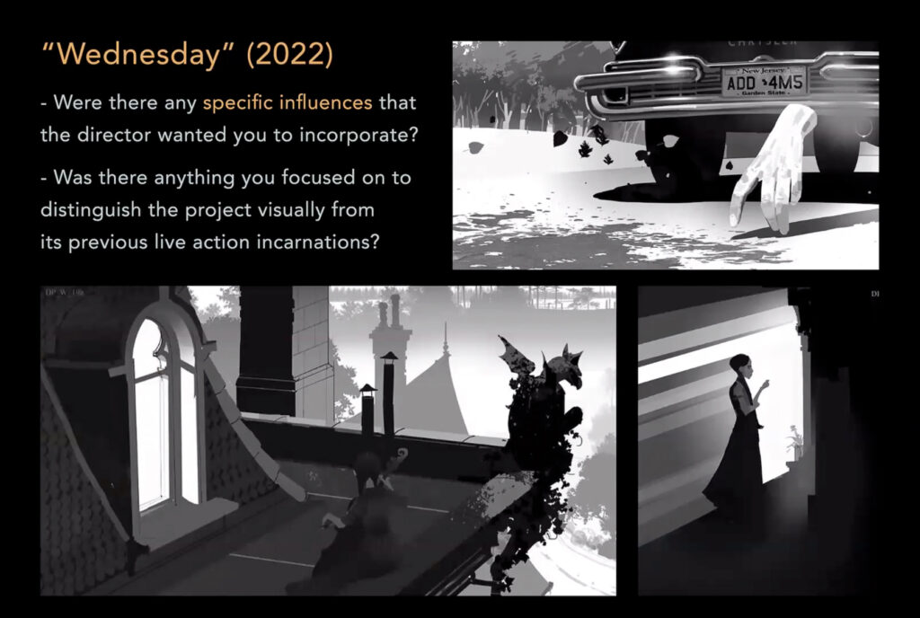
He continued, “Sometimes you do something slightly wrong because it makes you feel the thing a bit more than if you did it correctly. If I’ve got a fist coming out, you want to see a bit of length of arm to feel that—to read that—so sometimes, you cheat it. Even with ‘Wednesday’ here, [Powers gestures at drawing on the wall behind him] in that drawing I did for Netflix, every shape in that silhouette, I want you to be able to read it really simply, without even thinking about it. But it’s not particularly accurate. There’s loads wrong with it, but it’s more connected to the feeling I want to get across.”
Working with iconic film franchises
During the webinar, Carman touched on Power’s work in the “Star Wars” franchise and credited it as playing a huge role in solidifying the idea of visual development and concept art as a dedicated discipline.
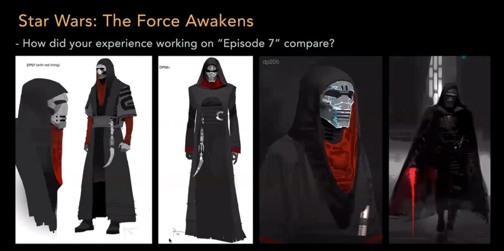
Power, who first worked on “Episode II,” would return to the franchise 15 years later. He worked with Director J.J. Abrams on “Episode VII” to assist in designing Kylo Ren’s iconic mask. The process took Power through multiple concept designs, none of which satisfied Abrams. One of the original mask designs featured an all-black mask with three yellow stripes across the front. “It looked like Kill Bill,” said Power. Ultimately, it was a mask design by fellow Concept Artist Glyn Dillon that made the final cut.
Another design dilemma Power shared was during his work on “Fantastic Beasts and Where to Find Them.” In conceptualizing the briefcase where the main character Newt Scamander keeps his menagerie of mythical beasts, Power’s original plan was to create an ambiance of night and day using an artificial sun and moon, which would move around each other. When he presented this idea with the navigator and the animation to “Harry Potter” creator and author J.K. Rowling, she said, “[Newt’s] not that good of a wizard.”
“He really just wants to care for his animals, so he’ll use magic to a point, and then he’ll do the rest a bit ham-fistedly,” said Power, delving further into the thought process behind film design. “So, we were looking at the [American Museum of Natural History in New York City] and the amazing panoramas, and we were like, okay, well, it can’t be that because that’s too good; we wanted to have it a bit rough around the edges and not perfect.”

For Netflix’s “Wednesday,” Power shared that he was not on the show for very long due to being split between two projects. But when Tim Burton, the series’ executive producer, reached out, Power wanted to be available for the beloved creator to bounce ideas off of and help develop the story.
“When I saw the trailer for ‘Wednesday,’ I saw the boats and was like, ‘Oh, they actually used my exact designs on the side of the boat,” Power recalled after seeing his designs make the final cut.
Putting together a portfolio
Toward the end of the presentation, the conversation turned to the topic of compiling a portfolio. Power recommended that students move away from highlighting turntable images of a character (drawings that show a character from the front, side, back, etc.), calling them “boring.”
“For the sake of your sanity, do something else,” advised Power. “Have the confidence to put one picture on a page and say, ‘That’s my design. What do you think?’ Not, ‘Here’s my design from all the different angles.’”
He further elaborated, “I don’t like people in my position describing the fiery hoops they had to jump through to get to where they are. I love doing what I do. I loved drawing, and that’s the bottom line. If you learn to draw and get an understanding of how to draw shapes and all that, you will be a better designer of whatever you do. Car design, whatever you do, you’re going to be better.”
To watch Power’s full presentation, please visit: video.academyart.edu/media/Concept+Design+IconA+Dermot+Power/1_m8lwc88w/206525813
Correction: A previous version of this article listed Power’s work at 2000 AD to include “Digitek.” Power worked on this title at Marvel UK. We regret this error.
