Brett Newman’s eclectic design portfolio balances experimentation with practicality
By Kyle Roe
The world of print may be shrinking, but Academy of Art University graduate Brett Newman has still managed to find a comfortable niche designing the pages of resilient cultural magazines. To date, his layout and typeface work have adorned the pages of visually cutting-edge publications like HYPEBEAST, Mohawk Maker Quarterly and The North Face.
Newman honed his artistic chops at the Academy’s School of Graphic Design (GR), where he earned his M.F.A. His initial career aspirations were in business, but after he earned his B.A. in marketing from the State University of New York at Fredonia, he reconsidered. “I got into design kind of late in the game, like at the end of my undergrad degree,” Newman said. “I had started shooting a lot of 35mm photography, and developing in the dark room, and that was sort of my first foray into visual communication.”
Soon after, he started shooting photos for his friends’ band posters, as well as athletic shots of their bike rides. “Once I had a little bit of skill in that world, I started looking at design programs,” Newman recalled. The Academy’s open portfolio program, in combination with the Bay Area’s strong cycling culture, drew the untrained designer to San Francisco all the way from upstate New York. Judging by his success and charming daily bike commute through Golden Gate Park, it was a wise decision.
“I think the Academy as a whole prepares their design students really well for work,” he reflected. “A lot of it is fundamentals, so everything is sort of built off your type, your layout and your composition … Overall principles of design are really strong in the Academy curriculums, and you need those to think the way you need to in the studio, and in the real world.”

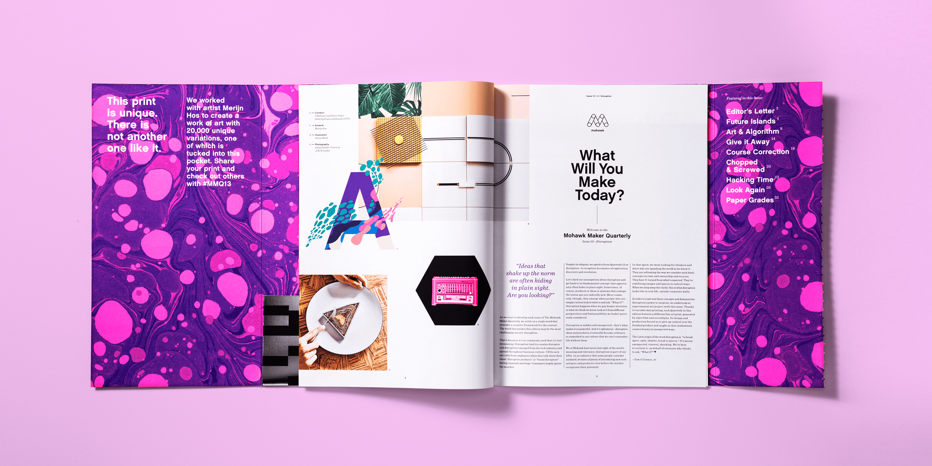
A look at Mohawk Maker Quarterly 13: Disruption, designed by Hybrid Design. Photo courtesy of Brett Newman.
He credits Academy typography instructors David Hake and Stan Zienka with helping develop his design skills, saying they “really pushed me to think about type both rationally and emotionally.”
“[Brett is] someone who’s obviously always paying attention, obviously engaged with the coursework,” said GR Director Phil Hamlett. “He’s definitely somebody who listened to what it was we had to say and applied it, and then went beyond what it was that we asked for.”
Newman is currently employed as a design director for Hybrid Design, a graphic design agency located in San Francisco’s Mission District focused on crafting unique and creative illustrative output. According to their website, their “creative team is divided into two camps: logical and experimental. This gives us a unique perspective for exploring and problem-solving. When these two worlds collide, amazing things happen.”
Newman’s portfolio with Hybrid reflects that dichotomy between experimentation and practicality. Alongside page layouts for abstract artwork and bold fashion trends are unfussy, straightforward branding initiatives for clients like Attaboy Beer, a “no frills brewery” based in Frederick, Maryland. The label’s clear-cut design communicates Attaboy’s brand and slogan in as few words as possible, then lets the beer do the talking. With print, however, Newman is allowed to let his imagination run wild.
“We basically just get to come up with wacky print and format ideas that most clients would be very afraid of, because of cost and uncertainty,” Newman said. “But because we’re working with a paper company, [you can] unleash the wildest, crazy paper ideas you can have on them, and it becomes something really special.”
Mohawk, a longstanding printmaking company, have trusted Newman and other Hybrid designers to craft the pages of Maker, their quarterly magazine, since 2016. Each issue focuses on a specific theme that is “derived from Mohawk’s brand values.” In one of them, “we were discussing the idea of disruption, and the many forms that it takes. Speaking about it in both a positive and negative sense.” The issue included a collaboration with Marin-based mountain biking pioneer Charlie Kelley. The resulting piece, “Fat Tire Flyer,” was named after an influential zine Kelley published in the 1980s, which covered “all the exploits and shenanigans that came along with taking heavy beach cruisers up to the top of a mountain and hurling oneself down again,” according to Newman.
“They’ve done a good job of staying contemporary and making sure that print is still alive and well,” Newman said of Mohawk, who began printing in 1931. “Just reminding people of the specialness and permanence of it.”
Featured photo: Academy of Art University School of Graphic Design alumnus Brett Newman. Photo courtesy of Brett Newman.
